
Creatura
I worked with a rapidly growing art studio that evolved into a restoration studio and academy. With an already captive audience, the goal was to elevate their professional image while expanding their reach to a broader market.
It all started with the logo.
Branding
Concept & Intent
Designing a guardian for art and restoration
Creatura Art & Studio required a symbol that could embody protection, craftsmanship, and historical continuity.
The identity needed to feel timeless, rooted in classical art traditions, remaining precise and contemporary in execution.

We are trained in classic techniques and we are proud to protect them

We like mostly naturalistic, realistic and baroque styles.
We seek excellence in the way the ancient masters did
The visual language draws from classical European sculpture, particularly the winged lion as a symbol of vigilance and guardianship, most notably present in Venetian art and architecture.
Additional inspiration comes from Gothic gargoyles, architectural guardians designed to protect sacred spaces.
These influences informed both the posture and the structural mass of the final mark.


Primary Palette
Dark Blue 20–25%
#092B35
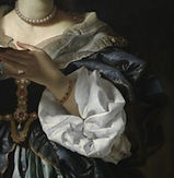
Painters like Caravaggio didn’t use pure black backgrounds most of the time.
They used very dark blues, greens, and browns to create depth and drama without flattening the image.
Cream 60–70%
#FEF9F3
This cream closely resembles:
-
aged paper
-
drawing sheets
-
primed canvas
-
lime plaster walls
Which connects directly to:
-
sketching
-
learning
-
restoration
-
process
Secondary Palette
Ink Graphite — functional dark neutral
#3E4A4D
Patinated Green — material accent
#5F7F73
Use for:
-
secondary emphasis
-
diagrams
-
restoration / process content
Use for:
-
body text
-
annotations
-
long-form educational content
Terracotta Clay
— warm accent
#C46A3B
Use for:
-
highlights
-
emphasis
-
small CTAs
-
educational callouts
Stone Shadow
— structural neutral
Use for:
-
dividers
-
captions
-
UI separators
-
backgrounds behind text
#CFC8BE
All secondary colors combined: 10–15% max
Typography - Balancing artistic excellence with openness
The target audience includes young, artistically inclined people preparing for art school or looking to improve their skills, as well as professionals in the art world seeking restoration services.
While the studio already attracted a younger audience, the brand needed a typographic choice that could balance the classical visual elements without making the identity feel old or inaccessible.
The selected typography helps bridge generations, preserving credibility and tradition while remaining approachable and contemporary.
MADE TOMMY

MADE Tommy was chosen as the primary typeface because it balances geometric clarity with a friendly voice.
Its proportions and letter rhythm provide contemporary warmth without sacrificing structure, helping the brand remain authoritative yet approachable.
This choice supports both educational audiences and professionals in the art world, and complements the classical influences of the logo system.
Typefaces in the same family of geometric sans, like Avenir, Futura, and other MADE Type faces, are often used in contemporary creative studios, galleries, and cultural brands where clarity, personality, and approachability are priorities.
Sketching

Another defining influence from classical masters such as Caravaggio is chiaroscuro.
I intentionally applied this principle to the logo, using contrast and shadow to emphasize form, depth, and visual tension.

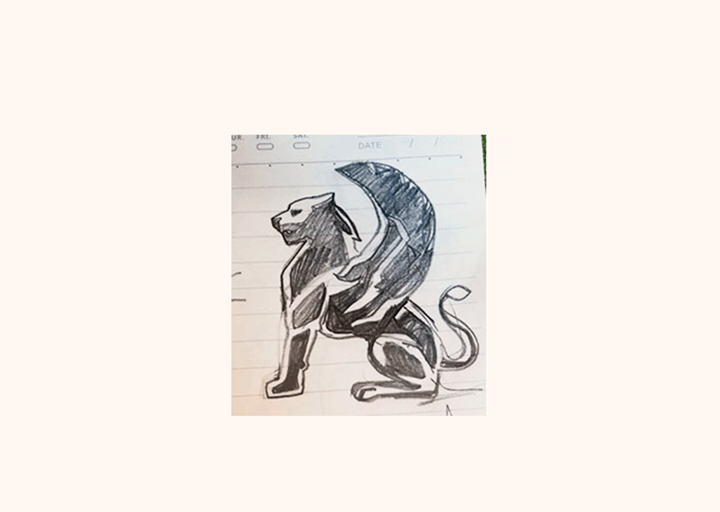
Cleaning the chosen sketch
The logo

