top of page
BCP BANK
Between 2022 and 2023, I collaborated with BCP, the largest bank in Peru, creating key visuals and visual systems for social and digital marketing campaigns.
I designed campaign assets aligned with the brand system and overall campaign strategy, and contributed to defining the campaign concept, grounding visual decisions in user insights derived from Google Analytics, heatmaps, and behavioral analysis to ensure alignment with user behavior and campaign performance.
Graphic Design - Visual Design


CASE 1 - Reframing Trust Through Cultural Insight
Insight
Users who struggled most with entering their information showed a strong affinity for soccer, a culturally significant passion in Peru.
Concept
We reframed data entry as a “golazo” (a big goal) positioning completion as a moment of achievement rather than risk.
Visual Direction
Soccer imagery and celebratory cues were combined with clear messaging to maintain brand consistency while introducing a confident, optimistic tone.
Early sketches
Design Rationale
By shifting perception before interaction, the campaign reduced emotional friction without changing the product flow.
Social Media


CASE 2 - New Beginnings, Designed for Action
Insight
The start of the year represents a strong moment for goal-setting and financial intention, when users are more receptive to change and long-term decisions.
Concept
We connected the idea of new beginnings with opening a new bank account, positioning it as the first concrete step toward new financial goals.
Visual Direction
New Year cues, fireworks, light, and celebration, were combined with clear product visuals to convey optimism, progress, and ease, while maintaining brand consistency.
Early sketches

Design Rationale
By aligning the product message with a culturally meaningful moment, the campaign framed account opening as a positive, forward-looking action rather than a procedural task.
Social Media


CASE 3 - New Beginnings, Designed for Action
Insight
A/B testing revealed that fun-driven messaging outperformed relaxation-focused concepts when encouraging users to open a new account during summer.
Concept
We leaned into summer fun, positioning digital account opening as a way to avoid bank visits and spend more time enjoying the beach.
Visual Direction
Bright colors, playful elements, and beach imagery were paired with clear product visuals to communicate ease, freedom, and immediacy.

Early sketches
Design Rationale
By emphasizing time saved and enjoyment gained, the campaign framed digital onboarding as a lifestyle advantage rather than a task.
Social Media

Cases like this were the bread and butter of every day
For every Visual piece you see, there's a case, an insight and KPIs.
A pretty visual is not enough, I use data to arrive at a concept and scale from there.
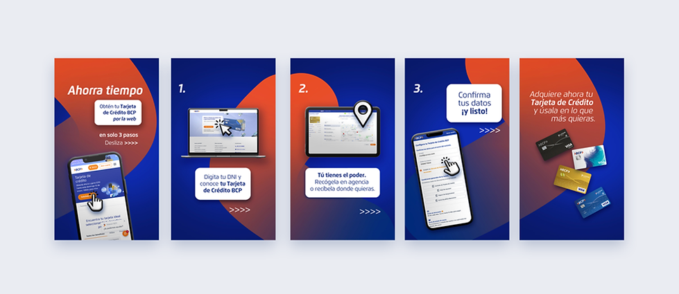
Informative Carrousel
Various formats


Various formats

bottom of page