top of page

Swovo Dashboard
UI Design - Visual Design
The task required two key deliverables:
-
Redesigning the information architecture to make managing teams and travel policies intuitive.
-
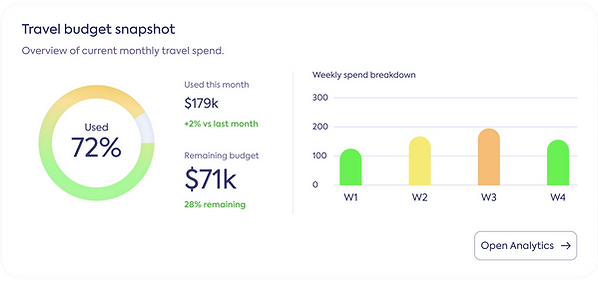
Designing a new admin dashboard that highlights the most important operational insights beautifully.
Their Design

Design Rationale behind their design
Their design is mainly thought from the developer's point of view, it has all the options on the screen, there's no hierarchy, no clear path for the user.
New Hierarchy


Design Rationale
With what the brief provided I grouped the type of alerts that the user needed and placed them on the screen, prioritizing what the user needs to see first, what they need to engage with first and giving the other actions a lesser hierarchy.
The New Design


bottom of page